library(tidyverse)
library(kableExtra)
library(cowplot)Remove LC-MS Batch Effects Using Linear Models
Introduction
In analytical chemistry data there are often batch effects that confound data analysis. One source of batch effects is variation in instrument sensitivity across the course of the run. Here I analyze a dataset that is plagued by this type of batch effect, and I use a linear model to correct, or “subtract out” this effect. The result of this correction is data with improved accuracy and substantially lower variance among sample replicates.
Procedure in R
Import necessary libraries
Import the data and view the structure
df <- read_csv("./data.csv")
kbl(head(df)) %>% kable_styling(full_width=FALSE)| Inject_order | Strain | Replicate | PA |
|---|---|---|---|
| 1 | Strain_1 | 1 | 121.4272 |
| 2 | Strain_2 | 1 | 217.0302 |
| 3 | Strain_3 | 1 | 327.8231 |
| 4 | Strain_4 | 1 | 440.5026 |
| 5 | Strain_5 | 1 | 527.3669 |
| 6 | Strain_1 | 2 | 121.5882 |
Plot the entire dataset by injection order
ggplot(df, aes(x=Inject_order, y=PA)) +
  geom_point(aes(color=Strain), size=2.5) +
  theme_bw() +
  labs(x="injection order", y="peak area", color=NULL) +
  theme(axis.title = element_text(size=14),
legend.text = element_text(size = 12)) 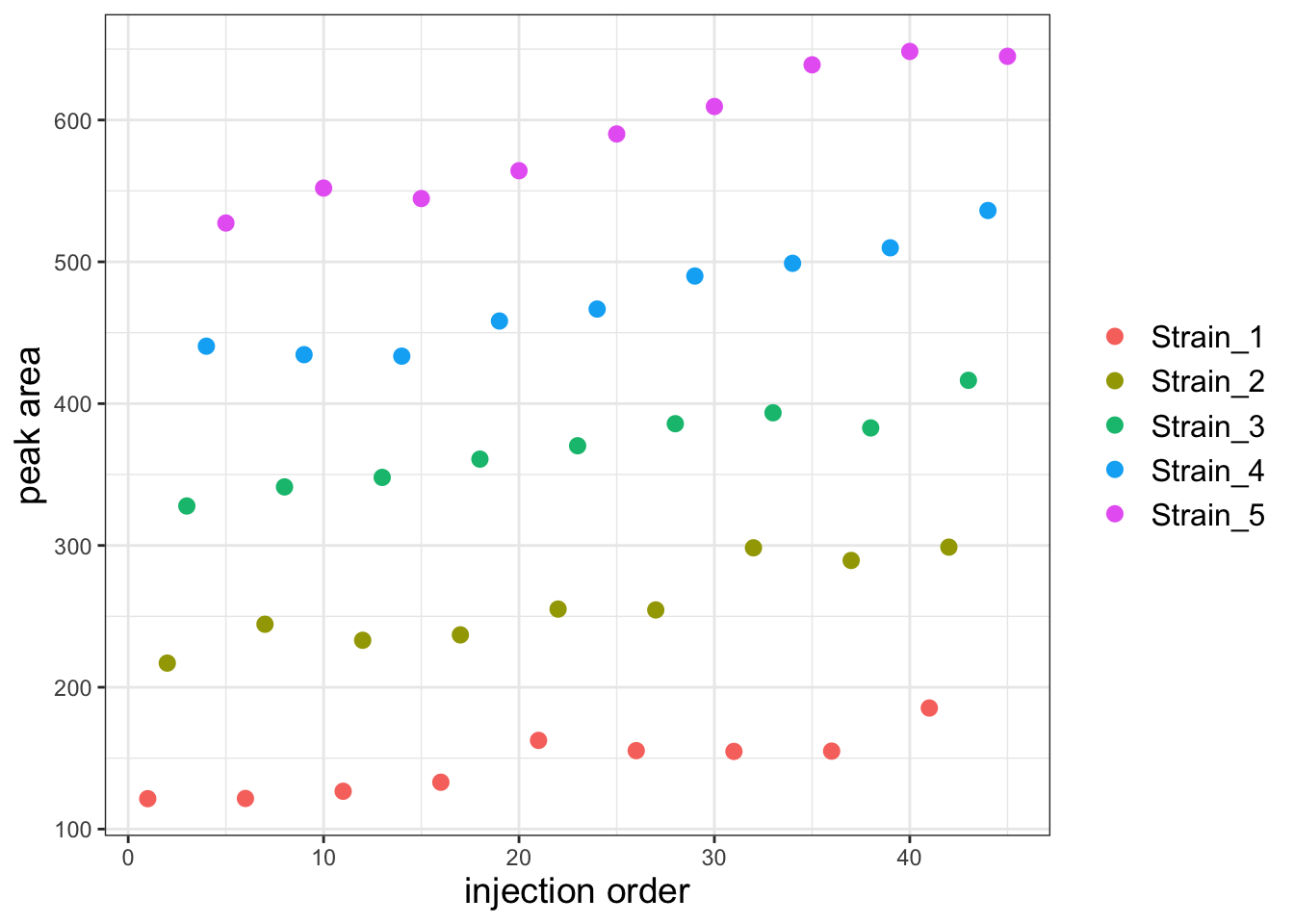
It looks like there is a substantial batch effect but I think it will be more obvious if I facet the plot by strain.
Plot again but facet wrap on Strain
ggplot(df, aes(x=Inject_order, y=PA)) +
  geom_point(aes(color=Strain), size=2.5) +
  facet_wrap("Strain") +
  theme_bw() +
  labs(x='injection order', y='peak area', color=NULL) +
  theme(axis.title = element_text(size=14),
        legend.text = element_text(size = 12))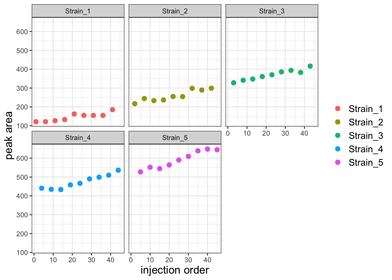
There is a clear batch effect with PAs increasing with injection order. Let’s first investigate whether we can capture this effect with a linear model. Let’s first create a model that predicts PA as a function of strain alone.
Create the model using Strain as the only predictor
strain_only_model <- lm(PA ~ 0 + Strain, data = df)
summary(strain_only_model)
Call:
lm(formula = PA ~ 0 + Strain, data = df)

Residuals:
   Min     1Q Median     3Q    Max
-63.76 -24.75  -3.51  23.88  61.91

Coefficients:
               Estimate Std. Error t value Pr(>|t|)
StrainStrain_1   146.18      11.21   13.04 5.49e-16 ***
StrainStrain_2   258.64      11.21   23.07  < 2e-16 ***
StrainStrain_3   369.66      11.21   32.97  < 2e-16 ***
StrainStrain_4   474.28      11.21   42.30  < 2e-16 ***
StrainStrain_5   591.13      11.21   52.72  < 2e-16 ***
---
Signif. codes:  0 '***' 0.001 '**' 0.01 '*' 0.05 '.' 0.1 ' ' 1

Residual standard error: 33.64 on 40 degrees of freedom
Multiple R-squared:  0.9937,    Adjusted R-squared:  0.993
F-statistic:  1272 on 5 and 40 DF,  p-value: < 2.2e-16
Next, let’s see if a model that adds injection order as a global batch effect fits the data better.
Make a model that predicts using strain and injection order
comb_model <- lm(PA ~ 0 + Strain + Inject_order, data = df)
summary(comb_model)
Call:
lm(formula = PA ~ 0 + Strain + Inject_order, data = df)

Residuals:
    Min      1Q  Median      3Q     Max
-25.259  -5.692   1.008   5.655  25.105

Coefficients:
               Estimate Std. Error t value Pr(>|t|)
StrainStrain_1  98.5204     5.3720   18.34   <2e-16 ***
StrainStrain_2 208.7059     5.4619   38.21   <2e-16 ***
StrainStrain_3 317.4616     5.5544   57.16   <2e-16 ***
StrainStrain_4 419.8059     5.6494   74.31   <2e-16 ***
StrainStrain_5 534.3877     5.7468   92.99   <2e-16 ***
Inject_order     2.2696     0.1505   15.08   <2e-16 ***
---
Signif. codes:  0 '***' 0.001 '**' 0.01 '*' 0.05 '.' 0.1 ' ' 1

Residual standard error: 13.03 on 39 degrees of freedom
Multiple R-squared:  0.9991,    Adjusted R-squared:  0.9989
F-statistic:  7097 on 6 and 39 DF,  p-value: < 2.2e-16
The residuals are much smaller in the combined model and the adjusted R2 is higher. This tells us that the model with both strain and a global injection order paramater as predictors fits the data better. We can confirm this with an ANOVA test. We use the ANOVA test here because the strain_only_model is a subset of the comb_model (you can get the strain_only_model by setting the Inject_order parameter to 0 in the comb_model). Note that the anova function will only tell us if the two models are significantly different, i.e. one fits the data significantly better than the other. If we get a significant p-value, this indicates that the model with more parameters is indeed a better fit.
Perform the ANOVA
anova(strain_only_model, comb_model)Analysis of Variance Table
Model 1: PA ~ 0 + Strain
Model 2: PA ~ 0 + Strain + Inject_order
Res.Df RSS Df Sum of Sq F Pr(>F)
1 40 45258
2 39 6624 1 38634 227.47 < 2.2e-16 ***
---
Signif. codes: 0 '***' 0.001 '**' 0.01 '*' 0.05 '.' 0.1 ' ' 1The two models are significantly different and the comb_model is a better fit to the data. We now know that injection order definitely confounds our analysis. Next we will proceed to subtract out the effects of injection order.
Extract the coefficient for the injection order and use this to calculate a corrected PA
# extract the injection order coefficient
injection_order_coef <- coef(comb_model)["Inject_order"]

# correct the PAs by subtracting (injection order coeffiient * injection order)
df$PA_inj_order_corr <- df$PA - (injection_order_coef * df$Inject_order)
Now plot the corrected data
ggplot(df, aes(x=Inject_order, y=PA_inj_order_corr)) +
  geom_point(aes(color=Strain), size=2.5) +
  facet_wrap("Strain") +
  theme_bw() +
  labs(x='injection order', y='peak area') +
  theme(axis.title = element_text(size=14),
        legend.text = element_text(size = 12))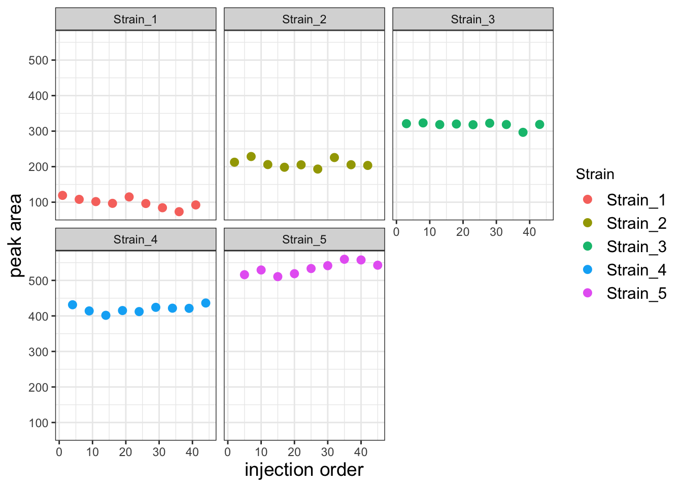
This corrected data looks much better. To get a sense for how much better the variability among replicates is, let’s compare the replicates for each strain using a boxplot.
Pivot the data into tidy format and create the boxplot
df_long <- df %>%
  pivot_longer(cols = c(PA, PA_inj_order_corr),
               names_to = "measurement_type",
               values_to = "value")

ggplot(df_long, aes(x=Strain, y=value)) +
  geom_boxplot(aes(fill=measurement_type)) +
  labs(x="", y="corrected peak area", fill=NULL,
       title='corrected with global injection coefficient') +
  theme_bw() +
  theme(axis.title = element_text(size=14),
        axis.text = element_text(size=12),
legend.text = element_text(size = 12)) 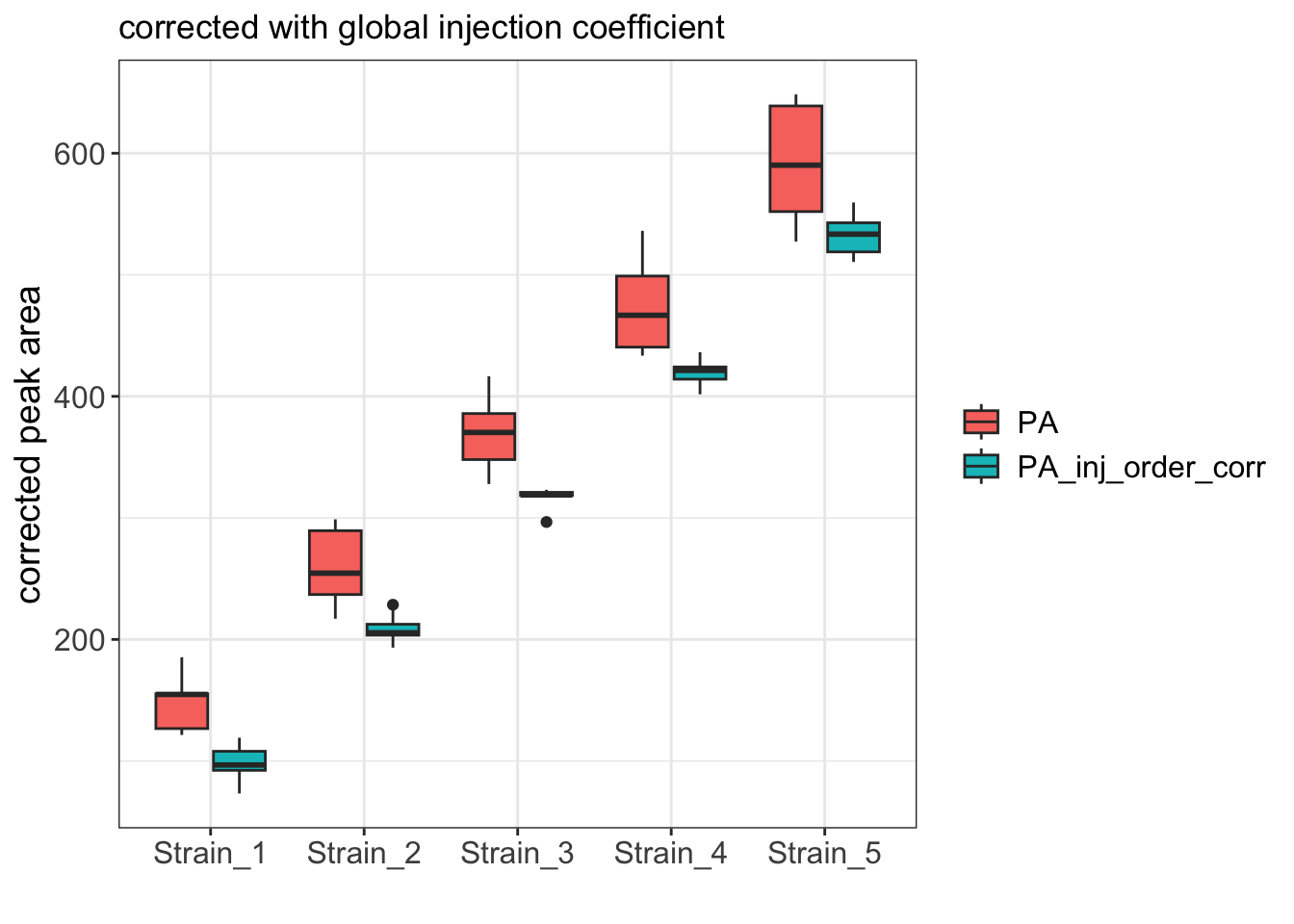
As expected, the boxplot shows that the variance among replicates is much better after the correction.
Further improvements
When building linear models, it is critical to examine diagnostic plots that report how well your model fits the data. These plots can reveal issues with the model that are more challenging to identify by assessing model summary statistics alone. The most basic, and often the most informative of these plots is the fitted vs. residuals plot.
Let’s start by plotted fitted values vs. residuals for both the strain_only model and the comb_model.
Make Fitted vs Residuals plots
# Get the residuals for this model and plot
df$strain_only_resid <- residuals(strain_only_model)
df$comb_resid <- residuals(comb_model)


p1 <- ggplot(df, aes(x=PA, y=strain_only_resid)) +
  geom_point(size=2) +
  ylim(-70,70) +
  theme_bw() +
  labs(title='strain_only_model', y='residual')

p2 <- ggplot(df, aes(x=PA, y=comb_resid)) +
  geom_point(size=2) +
  ylim(-70,70) +
  theme_bw() +
  labs(title='comb_model', y='residual')

# Combine plots
plot_grid(p1, p2, ncol = 2)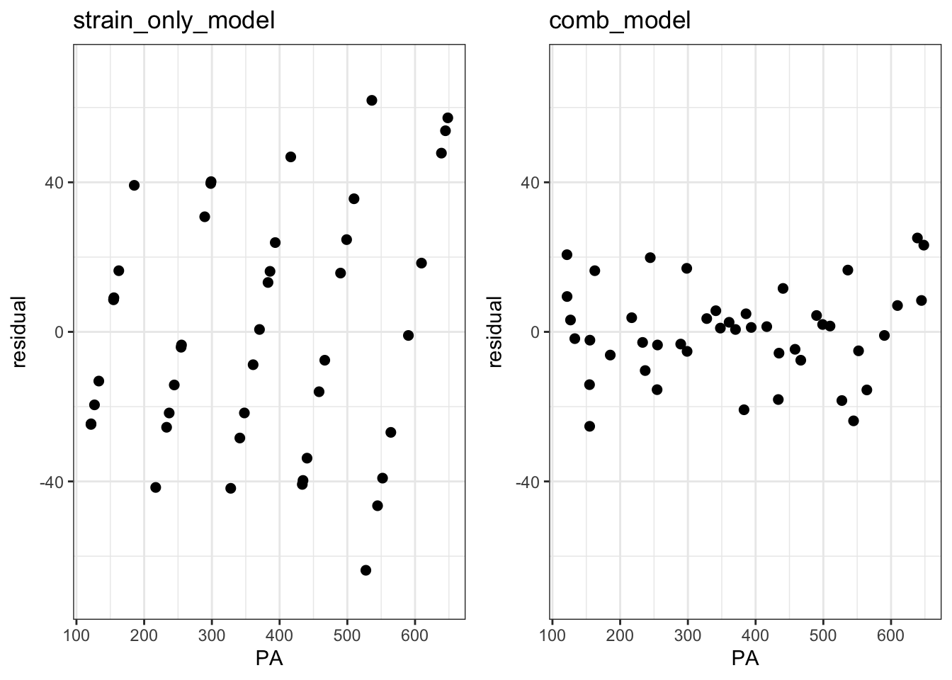
These plots reveal an issue with our models. The funnel-like shape of the left plot shows heteroscedasticity where variance scales with the peak area. In the right plot, the overall variance is substantially reduced by included injection order as a predictor, but it is still heteroscedastic: Samples with intermediate peak areas have low variance relative to those with small or large peak areas. This suggests that the global injection order coefficient that we subtracted was the best average coefficient across all samples, but it may not have been the best coefficient for each sample. In other words, the injection order batch effect might be better modeled with a distinct coefficient for each sample. Let’s try this by modeling this batch effect as an interaction term between strain and injection order.
Fit a Strain : Inject_order interaction model
interaction_model <- lm(PA ~ 0 + Strain + Strain:Inject_order, data = df)
summary(interaction_model)
Call:
lm(formula = PA ~ 0 + Strain + Strain:Inject_order, data = df)

Residuals:
     Min       1Q   Median       3Q      Max
-16.5623  -5.1820  -0.9357   4.2041  19.3509

Coefficients:
                            Estimate Std. Error t value Pr(>|t|)
StrainStrain_1              115.7752     6.4949  17.825  < 2e-16 ***
StrainStrain_2              213.8987     6.7208  31.826  < 2e-16 ***
StrainStrain_3              324.0138     6.9493  46.625  < 2e-16 ***
StrainStrain_4              412.5630     7.1802  57.458  < 2e-16 ***
StrainStrain_5              508.3681     7.4133  68.575  < 2e-16 ***
StrainStrain_1:Inject_order   1.4480     0.2635   5.496 3.57e-06 ***
StrainStrain_2:Inject_order   2.0336     0.2635   7.718 4.63e-09 ***
StrainStrain_3:Inject_order   1.9848     0.2635   7.533 7.95e-09 ***
StrainStrain_4:Inject_order   2.5714     0.2635   9.760 1.60e-11 ***
StrainStrain_5:Inject_order   3.3104     0.2635  12.564 1.57e-14 ***
---
Signif. codes:  0 '***' 0.001 '**' 0.01 '*' 0.05 '.' 0.1 ' ' 1

Residual standard error: 10.2 on 35 degrees of freedom
Multiple R-squared:  0.9995,    Adjusted R-squared:  0.9994
F-statistic:  6948 on 10 and 35 DF,  p-value: < 2.2e-16
All of the interaction terms are significant with different coefficients. This suggests that indeed this model fits better than the previous model with the global injection order parameter. The higher adjusted R2 value of this model confirm this.
Let’s now try correcting the peak areas with this interaction model.
Correct the peak areas using the better fitting model
# Extract the coefficients from the model and put them in a df
strains <- paste0("Strain_", 1:5)
coefs <- coef(interaction_model)[6:10]
coef_table <- data.frame(Strain = strains, inj_x_strain_coef = coefs)

# Add the coefficients to df and calculate corrected peak areas
df <- df %>%
  left_join(coef_table, by = "Strain") %>%
  mutate(
    inj_x_strain_value = inj_x_strain_coef * Inject_order,
    inj_x_strain_corr_PA = PA - inj_x_strain_value)
Assess the Fitted vs Residuals plot for the interaction model
# get the residuals
df$strain_x_inj_resid <- residuals(interaction_model)

# make the plot
p3 <- ggplot(df, aes(x=PA, y=strain_x_inj_resid)) +
  geom_point(size=2) +
  ylim(-70,70) +
  theme_bw() +
  labs(title='strain_x_injection_order_model', y='residual')


# plot alongside the comb_plot residuals
# Combine plots
plot_grid(p2, p3, ncol = 2)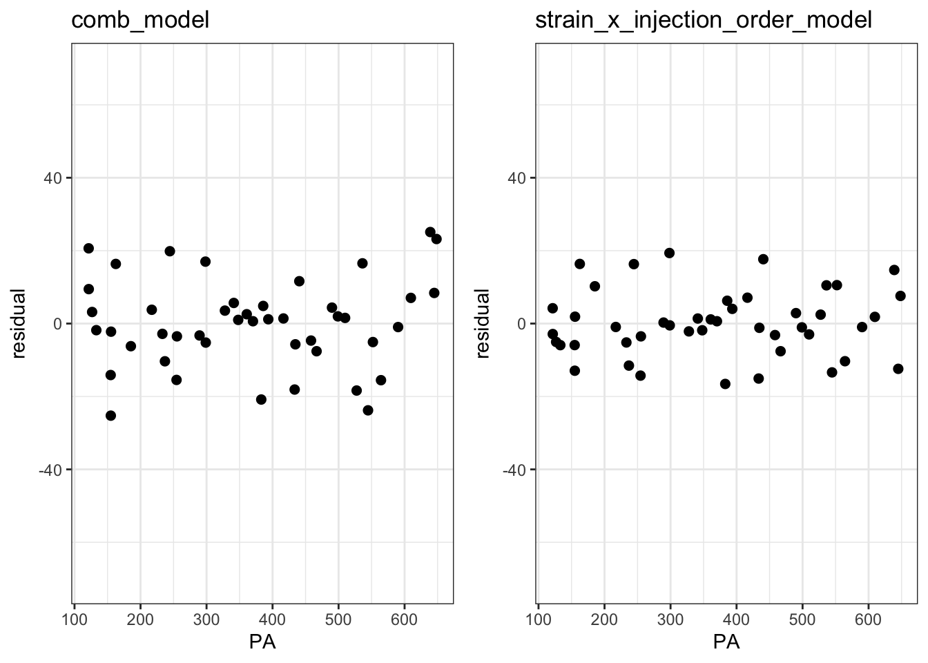
The Fitted vs Residuals plot looks better the interaction model with smaller overall residuals and less heteroscedasticity.
Compare all peaks areas via boxplot
# pivot the df
df_long <- df %>%
  pivot_longer(cols = c(PA, PA_inj_order_corr, inj_x_strain_corr_PA),
               names_to = "measurement_type",
               values_to = "value")

# order the plotting variables
df_long <- mutate(df_long, measurement_type = factor(measurement_type,
                  levels = c("PA", "PA_inj_order_corr", "inj_x_strain_corr_PA")))

# make the plot
ggplot(df_long, aes(x=Strain, y=value)) +
  geom_boxplot(aes(fill=measurement_type)) +
  labs(x="", y="corrected peak area", fill=NULL) +
  theme_bw() +
  theme(axis.title = element_text(size=14),
        axis.text = element_text(size=12),
legend.text = element_text(size = 12)) 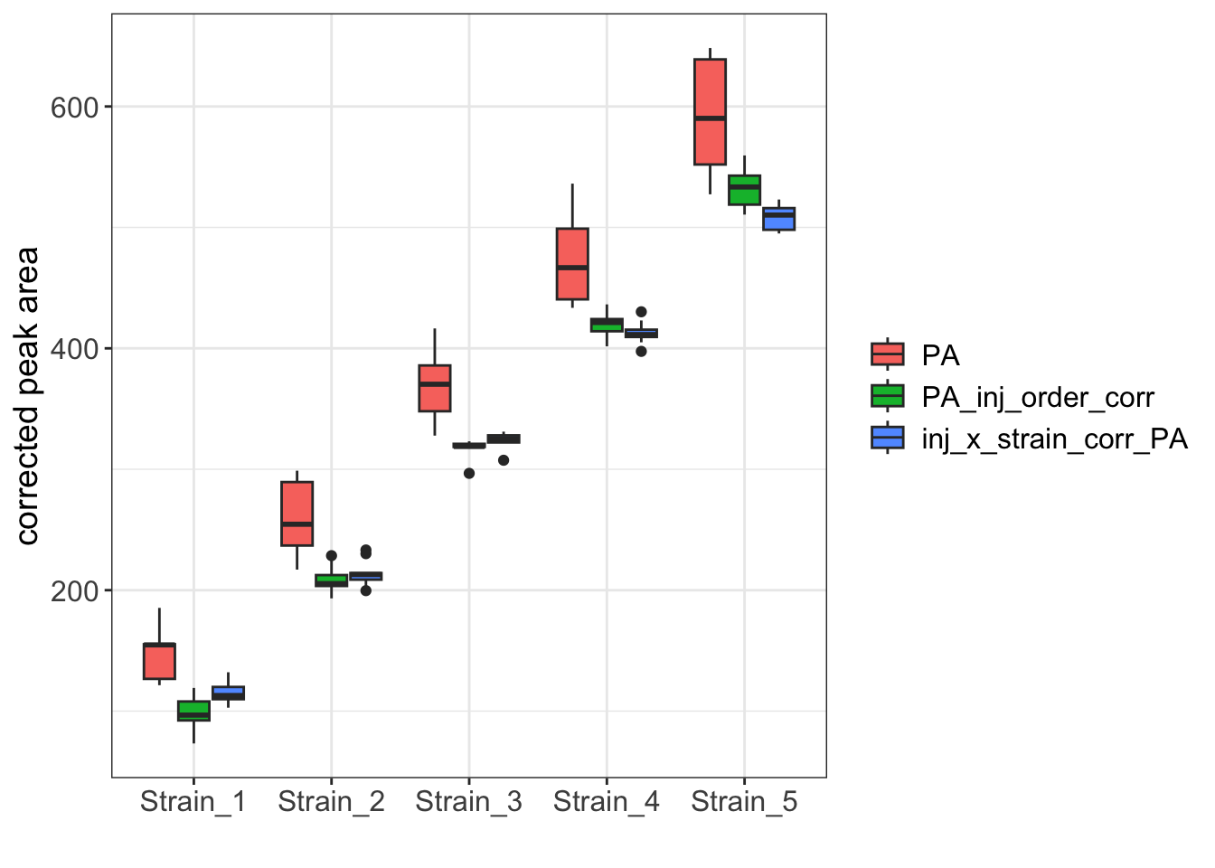
While the boxplot for the two corrected datasets are similar, the Strain_1 and Strain_5 samples clearly have reduced variance when corrected with the interaction model.